
You’ve probably noticed that not all book covers are created equal. Some beg to be picked up and explored, some sit there on the shelf as part of the bibliographic scenery, and others may cause you to wince because they are just so awful.
There’s nervous anticipation every time I open my email. Anticipation that I shall finally get to see the first edition of the cover for The Tethered World. Am I nervous? You bet I am. I’m just enough of an artist myself to have strong opinions about these sort of things. Add to that the amount of control I have over this arm of the publishing journey (as in, zilch), and I’m learning I may be more of a control freak than I’d like to admit!
Writer’s refer to their books as their “baby” and for good and obvious reasons. We were there at conception, growth, birth, and maturity. Instead of 9 months, we may carefully cultivate our project for years and years. And now . . . now some third-party person, which hasn’t read my story, is going to perfectly capture the essence of my years of nurturing and feeding and growth on a single two-dimensional page?
Well, maybe . . .
You’ve probably noticed that not all book covers are created equal. Some beg to be picked up and explored, some sit there on the shelf as part of the bibliographic scenery, and others may cause you to wince because
 they look so-um- awful. My publisher, Finding Christ Books, may be a small, traditional press, but they do know the power of a professional cover. They’ve hired some of the industries best graphic designers for their books, which makes me (the control-freak, moonlighting artist that I am) rest a little easier as I anticipate the first peek at my baby’s ‘face’.
Part of what I had to do to prepare the artist to tackle my project, involved lengthy character, creature, and setting descriptions, along with certain scenes that would make for an interesting cover scenario. I looked at tons of other YA Fantasy covers, trying to get a feel for the different approaches within the market. I found the covers boiled down to about five different styles. I thought I’d post some examples here, and see what YOU guys like or dislike when it comes to a fantasy book cover. (Forgive the funky picture layout. Couldn’t be helped). Remember to take the poll at the end!
The most popular approach among YA Fantasy cover involves a close up of a girl. Whether she’s a little  mesmerized at her magical surroundings, or ready to kick some elvish butt, over half the fantasy covers focus on the main character which, for some reason, tend to be predominately female. Sometimes it’s a ‘real’ flesh and blood person, sometimes a realistic rendering.

Focusing on the setting and mood of the story is another way covers are portrayed. Though there may be a
 person or two involved, they are not the main idea. Readers are given a glimpse of the realm, the magic, or the atmosphere of the book.

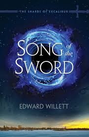
Another angle artists choose is to concentrate on something simple. Whether the attention is focused on the title, with it’s font and positioning evoking a certain feel, or on an item, like a sword . . . there’s not much going on in the periphery.


Some artists choose a very stylistic approach. The combination of patterns and font, maybe a small picture or silhouette, combining for a total package of a very artful layout.


Lastly, there’s the fully-animated look. I find this approach to reflect more of a middle-grade feel, but it is used in YA as well. And, hey, it obviously worked for J.K. Rowling!


Though some of these examples cross over into one another a bit, and there are a few others that I didn’t post that may not fit into any of these categories, I think these five make up the bulk of the YA Fantasy cover realm.
YOUR TURN: Which of these five are you MOST attracted to, when skimming the shelves or cruising around Amazon.com? And then take the poll for your LEAST favorite! Let’s hope what I end up with for my book cover won’t fall in to that particular category, LOL! I’d love to have more details on your preferences left in the comments as well. Maybe I should have posted this survey before the prep work for my cover began!
Completely agree!
I’m torn between simple and stylistic. I like something that hints, but since I know what I imagine will be totally different I don’t want to have my mind forced into a box of what the artist thought. 🙂 I don’t like Main at all… they start to look like YA romance novels after a while.
I’m not really drawn to the main character focus so much. 1) It doesn’t really tell you anything about the story or add to the title. It’s just a random person you don’t know yet. 2) I prefer forming my mental pictures of characters and settings based on the author’s descriptions, rather than having it influenced by someone else’s rendering. :-p The setting can be cool if done well, but it still runs the risk of being too vague, like the main character focus. I think my favorite is probably the simple/symbolic style. Having the focus on one thing such as a specific object from the story often piques my curiosity, because then I want to know what its significance is and how it fits into the story. I want it to draw my attention, but not be too distracting or confusing. Anyway, that’s my two cents. 😉 But I’ll still read your book regardless, because I already know it’s going to be awesome!
Good thoughts, Steph! Those are all important ideas to bring up to the publisher and artist!
I’ll be looking forward to my own copy of yours, too!
Fun post! 🙂 Any of the options can be good, if done well. Though personally, I like to fill in my mental picture of the main character from the story rather than a cover image. (Maybe I’ve just seen one too many flawless looking girls peeking out of the YA section.)
Yes, I like to come up with my own idea of MC as well. I often do, even if there’s a picture.
Agreed! That would have been a deal breaker for me, too.
I totally judge a book by its cover. I judge a small press by their covers, too! I shall never submit my book anywhere where the covers are lame or unprofessional in my opinion. 😛 I like character or setting focused covers, and sometimes animated/art ones if they are well done and not too cartoony.
Ha ha, Rob! If it’s third grade-esque then just have one of your kids draw you a nice Crayola cover! If a publisher wants your goods, you’ve at least made it out of the third grade. Maybe even junior high 🙂
Yes, I am grateful for a Pub that wants to invest in a good cover, and I’m sure whatever it is will grow on me if it is done well. I just hope I don’t open the pdf file that finally comes to my inbox and think “This bears no resemblance to my baby!”
I think you’ve stuck to that beautifully with your covers, RJ! I definitely prefer simple over complex, even if it is in any of those other categories.
Oh yes, I’ve seen some sad, sad self-pub covers 🙁
I must say, that sounds like the worst marketing strategy ever, in your example! I’d feel like it was false advertising to do such a thing to my readers.
Yes, if balanced well, I like that too.
I really like the stylistic covers, but ones that focus on some simple object are very cool too. 🙂
I will take a clear cut character or something that represents the story as my 1 and 2. I will leave an animated cover, it totally turns me off.
But I will be glad to have whatever cover a publisher wishes to put on my yet unpublished collection of 3rd grade dribble.
You are the real winner!!!!!
I liked the simple focus cover best because I actually judge a book by its title, not cover. I think I’m one of the only people who do that though…
I think you’ve stuck to that beautifully with your covers, RJ! I definitely prefer simple over complex, even if it is in any of those other categories.
Thank you, Heather!
I definitely judge books by their covers but I’m not too picky which style so long as they are well done and there’s no blood on the cover. I just detest the “self-published-barely-knows-photoshop” look.
Though the cover really does need to be relevant to the story. I heard recently about a book that had an awesome proto-type cover and then they changed it to feature a girl when the main character is a boy and the feel is historical when it’s a quirky fantasy. That’s not going to draw the right crowd to pick it up!
Oh yes, I’ve seen some sad, sad self-pub covers 🙁
I must say, that sounds like the worst marketing strategy ever, in your example! I’d feel like it was false advertising to do such a thing to my readers.
I like combination of main character and setting.
Yes, if balanced well, I like that too.
I guess “symbolic” would have been a more appropriate word for Simple Focus….oh well! Fatigued brain to blame!
And I just looked up “Ballentine” because, honestly, I didn’t know what you meant 😉 Yes, those are super-cool, old school style covers that didn’t even come up when I Googled images for Fantasy. Apparently not so popular these days…but it would be awesome to have that feel on my cover. My favorite, among what I categorized, is the Stylistic.
I am a book cover judger! For fantasy, either:
1. Ballantine style.
2. Cheesy 80s style.
3. Something symbolic.
If I see another rueful robed hot chick on the cover–whether human, superhuman, or paranormal–I think I’ll give up.
Cheesy 80’s LOL! I forgot to include that category! I am truly hoping the graphic artist does NOT go with the cover-chick thing. So overdone. That is MY least favorite as well.
I must admit that some of them are really beautiful. But when you stand back from a wall of the robes and distant looks, they blur in my vision.
I think the symbolic part of the cover is huge!
Agreed. There must be a specific meaning conveyed. Not a vague sort of ambience.